Newsletter Formatting Tips — 8 Ways to Maximize the Impact of Your Publications

A well-formatted newsletter does more than look attractive. It also guides the reader’s eye, makes information easier to absorb, and increases the chances that your audience will actually read what you’ve worked hard to create. Whether you’re preparing a
digital newsletter, a print edition, or both, effective formatting helps you communicate clearly and maintain a consistent, professional image.
Newsletter Formatting Tips
Here are some practical formatting tips to ensure your next newsletter doesn’t fall flat!
1. Start With a Clear Structure
A good newsletter layout begins with a logical, easy-to-follow structure. Most readers skim before they commit, so your format should highlight important sections and allow readers to navigate quickly.
Key recommendations:
- Use a clear header section with your newsletter name, issue date, and logo.
- Break content into sections, such as announcements, events, features, and resources.
- Keep the order consistent from issue to issue so readers know what to expect.
A predictable structure helps people find the information they care about without feeling overwhelmed.
2. Choose Easy-to-Read Fonts
Typography plays a major role in whether your content is easy or frustrating to read. Use simple, clean fonts that display well both in print and across electronic devices. Truly, these fonts should already be part of your brand. If you don’t have a distinct brand that includes a logo, colors, and fonts yet, learn more about how important a brand is in building trust for your organization with
our brand guide.
A few helpful hints when it comes to selecting fonts are:
- Use no more than two or three fonts in total: one for headings, one for body text, and an optional accent font.
- Choose sans-serif fonts for digital newsletters (e.g., Arial, Helvetica, Open Sans) for better screen readability.
- Use serif fonts (e.g., Georgia, Times New Roman) for print newsletters if you prefer a more traditional, formal appearance.
- Keep body text between 10 to 12 points for print or 14 to 16 pixels for digital formats.
Consistency across your font choices contributes to a polished, organized look.
3. Use Visual Hierarchy to Emphasize Key Information
Visual hierarchy helps guide readers through your content by signaling what is most important. Headings, subheadings, bullet points, and color accents all help break large blocks of text into digestible pieces.
Consider these tactics:
- Make section headers bold or slightly larger.
- Use subheadings to divide long articles or updates.
- Add bulleted lists or numbered lists to make details easy to skim.
- Use bolding, italics, or color sparingly to highlight key words or phrases.
A strong hierarchy reduces reader fatigue and keeps people engaged.
4. Incorporate White Space
White space, also known as negative space, is a critical but often overlooked formatting element. It keeps your layout from feeling cluttered and gives readers’ eyes room to rest.
Some ways to add white space effectively are:
- Increase spacing between paragraphs and sections.
- Add margins around images and graphics.
- Avoid packing too much text into narrow columns.
- Use simple, clean design elements, rather than dense patterns.
As you are formatting your newsletter, keep in mind that white space creates a calmer, more professional feel and improves overall readability.
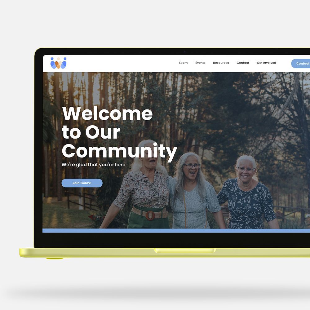
5. Balance Text and Images
Photos, illustrations, clip art, and other graphics bring your newsletter to life, but balance is essential. Too many visuals can distract from your message; too few can make your layout feel flat.
For best results:
- Choose high-quality, relevant images that support your content.
- Use consistent image sizes or shapes for a cohesive appearance.
- Avoid crowding images — give them breathing room.
- Using a content library like WeCreate can save you a ton of time by providing professional graphics and content at your fingertips.
- Add captions when an image needs context or attribution.
Whether you’re using photographs, clip art, or custom graphics, visual elements should enhance — not overwhelm — your content.
6. Keep Columns Clean and Consistent
Many newsletters use a multicolumn layout because it’s familiar and easy to read. If you use columns, be sure to keep them neat and uniform.
Some suggestions include:
- Limit content to two or three columns per page or screen.
- Maintain equal spacing between columns.
- Avoid splitting sentences or paragraphs across columns when possible.
- Position headings clearly at the top of a column to avoid confusion.
Keeping columns consistent throughout your publication creates a magazine-like feel while also keeping your newsletter organized.
7. Use Color Purposefully
Color can bring energy and personality to your newsletter. But
it should be used thoughtfully to maintain readability and brand consistency, and not overwhelm the eye.
Effective color theory practices include:
- Stick with your organization’s brand palette when possible.
- Use color to differentiate sections or highlight key items.
- Avoid overly bright or clashing colors that strain the eyes.
- Ensure sufficient contrast between text and background for accessibility.
- Avoid white or very pale font colors, which can be hard to read for aging eyes.
Remember, color should guide, not distract, your readers.
8. Proofread and Test Before Publishing
Even the best formatting won’t save a newsletter if it has typos or inconsistent spacing. Before sending or printing, do a thorough review. Avoiding potentially embarrassing misspellings or mistakes is crucial.
Be sure to:
- Proofread for grammar, spelling, and clarity.
- Ensure that headings, fonts, and spacing are consistent.
- Test digital newsletters on mobile devices and desktops — layouts can shift.
- Print a sample page of printed newsletters to check margins and clarity.
Learn More About LPi’s Publication Services
Great formatting can help turn your newsletter into a polished, readable, and engaging publication. With clear organization, thoughtful design, and consistent visual cues, your message will shine — and your readers will keep coming back for more.
If you need a partner to help with your newsletter production,
LPi is the best in the business!
Share
You might also like