Using Color Theory to Create Eye-Catching Communications
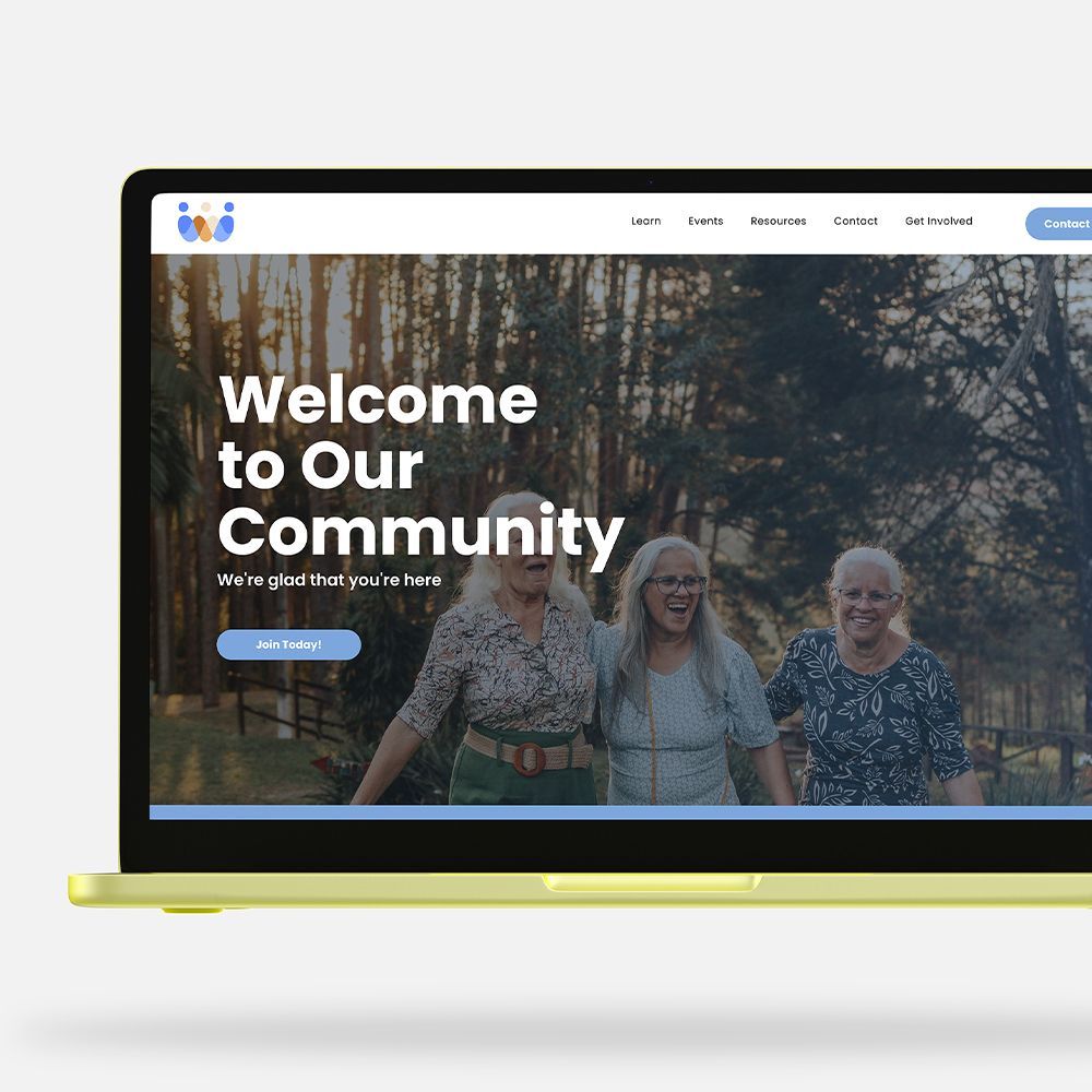
Color is one of the most powerful tools in design, capable of influencing emotions, perceptions, and behaviors. At LPi, we provide communication resources to nonprofits nationwide. Through our work providing newsletters, branding, websites, and content, we’ve seen firsthand how intentional color choices can significantly influence how an organization’s audience connects with and responds to their message.
Understanding color theory — the science behind how colors interact and the emotions they evoke — can help you make intentional, strategic choices that will create eye-catching and effective communications. Here’s a guide on how to use color theory to enhance your designs and better connect with your audience.
Understanding Color Theory Basics
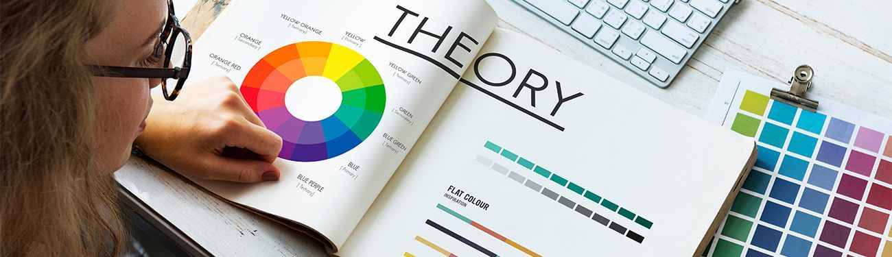
At its core, color theory is based on the color wheel — a circular diagram that shows how colors relate to one another. Colors can be categorized into primary, secondary, and tertiary groups:
- Primary colors (red, blue, yellow) are the foundation of all other colors.
- Secondary colors (green, orange, purple) are created by mixing two primary colors.
- Tertiary colors (e.g., red-orange, yellow-green) are made by mixing a primary color with a secondary color.
The relationships between these colors form the basis of various color schemes used in design. These schemes are essential for creating harmony and contrast in your designs.
The Power of Color Combinations
- Complementary colors: These colors are opposite each other on the color wheel (e.g., red and green, blue and orange). Complementary pairings create high contrast and are visually striking. They grab attention, making them perfect for calls to action or important elements in your communication, like buttons or key messages. However, because they create such a contrast, they should be used carefully to avoid overwhelming your audience. A complementary color scheme works well when you want to highlight something important while maintaining balance.
- Analogous colors: Colors located next to each other on the color wheel (e.g., blue, blue-green, green) are harmonious and pleasing to the eye because they share a common hue. Using analogous colors creates a more unified and calming effect, which is perfect for designs that aim to evoke peace, comfort, or professionalism. This scheme works well for backgrounds, subtle text highlights, and areas where you want to keep attention focused without distraction.
- Triadic colors: A color scheme that uses three colors that are evenly spaced around the color wheel (e.g., red, yellow, blue) is known as a triad. This combination offers both contrast and harmony, producing a vibrant and energetic look. Triadic schemes are great for designs that need to be dynamic but balanced, like brand logos or promotional materials.
- Monochromatic colors: A color scheme that uses variations of one color is considered to be monochromatic. It involves adjusting a color’s shade, tint, or tone (e.g., light blue, blue, dark blue). This approach is simple and elegant, providing a cohesive and professional feel. It’s ideal when you want to focus attention on a specific theme or message and don’t want colors to be too distracting.
Using Color Psychology to Evoke Emotion and Build Brand Identity
Colors do more than just look appealing — they also evoke specific emotions. For example:
- Red is bold, energetic, and often associated with passion, urgency, and excitement. It’s commonly used in calls to action.
- Blue conveys calm, trust, and professionalism. It’s frequently used to build credibility and reassurance.
- Yellow is bright, cheerful, and optimistic. It can stimulate creativity and attention but should be used in moderation.
- Green symbolizes nature, growth, and health. It’s a popular choice for environmental or wellness brands and is often used to induce feelings of calmness and balance.
- Purple signifies luxury, creativity, and spirituality. It’s commonly used in high-end branding or to express a sense of elegance.
- Orange is fun, energetic, and inviting. It’s often used to encourage action and excitement, making it suitable for promotions, events, or youth-focused designs.
- Black is sleek, powerful, and timeless. It’s widely used in fashion and luxury branding for its sophisticated and professional appearance.
Aligning your color choices with the message and mood you wish to convey can ensure consistency for your brand and its values.
Using Color Contrast for Readability and Accessibility
When designing for web or for print, ensure there is enough contrast between text and background colors to improve readability. A common mistake is using low-contrast color combinations, like light gray text on a white background, which can strain the eyes and make content difficult to read. To make sure your design is accessible, check that color-contrast ratios meet accessibility standards for people with visual impairments.
Additionally, avoid using too many bright colors together, as this can overwhelm the reader. Instead, balance bright colors with neutral backgrounds (e.g., white, gray, beige) to keep the design clean and readable.
Learn More on the LPi Blog
If you found this article of interest, we encourage you to bookmark the “Art and Design” section of our blog and visit often. We routinely share resources to help your organization connect and engage with your target market.
Subscribe to our monthly newsletter to get resources like this delivered directly to your inbox for free!
Updated 11-07-2025
Share
You might also like