How to Find the Best Clip Art for Newsletters and Communications
Clip art images, vectors, and custom graphics can instantly elevate the look of an organization's newsletter. Not only do the right visuals help break up text and draw attention to important information, but they also give your publication a sense of personality and professionalism.
If you’re not a graphic designer and you’re wondering where to find clip art, icons, and graphics for your newsletter, don’t worry! There are plenty of resources online to help you find high-quality clip art that fits your message and won’t get you into copyright trouble.
Use a Clip Art Library for Your Communication Needs
If you need friendly, easy-to-understand graphic options like clip art, subscribing to a curated online content library like WeCreate is your best move.
Common features that make clip art from a content library easy to use include:
- PNG or JPG formats for easy placement in newsletters
- High resolution graphics that look great printed
- Collections designed around specific themes
- Large, easy-to-search collections
- Professional illustrations that blend well with branded newsletters
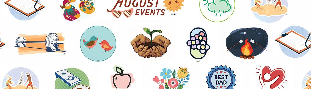
A subscription to WeCreate works especially well for community newsletters that need beautiful, professional-looking imagery. Every month, WeCreate adds newly designed graphics and clip art for seasons, holidays, activities, comics, puzzles, and more, giving subscribers access to fresh content!
How to Keep Your Clip Art and Graphics From Looking Unprofessional
Clip art has evolved a lot since the early days of publishing. What might have looked amazing 20 years ago won’t be appropriate nowadays for your modern audience. If you’re still using the same clip art and graphics you’ve been using since the 90s, it’s time to update your style!
Here are a few tips to modernize:
- Choose clip art that is the same, or at least a similar "style," so your efforts look coordinated. For example, if you use five pieces of clip art that look like hand-drawn sketches, but one of them looks like a realistic image, the discontinuity can look less than professional.
- If you are printing in color, use bright colors and follow the same concept as above. If half your clip art is black-and-white and the other half is in color, that can be confusing.
- As for your publication’s copy — don't stray from one or two fonts. Keeping your style consistent helps readers feel familiar with your publication, even if the graphics change!
- When possible, use professionally made graphics.
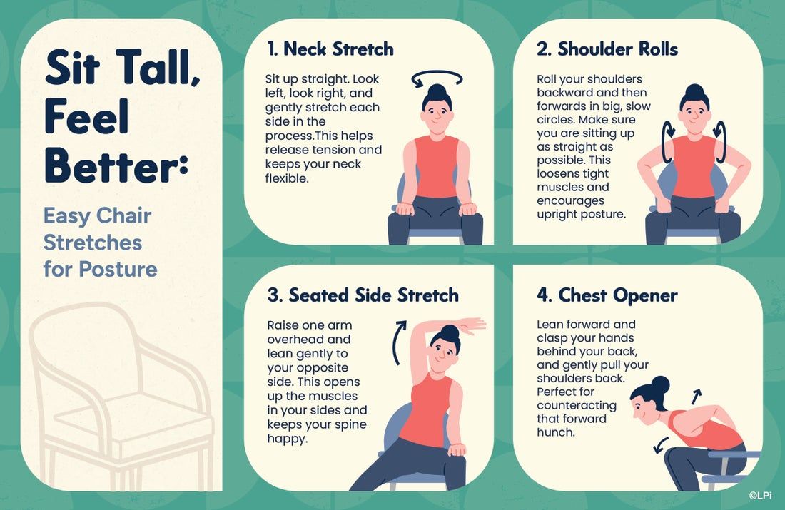
- Be sure to use more than just clip art. Graphics like the infographics in WeCreate can add a professional touch to your publication! For example:
The Best Solution for Print and Digital Newsletters
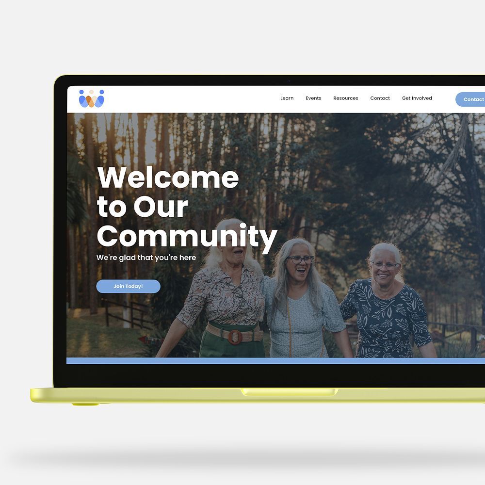
Creating a polished, engaging newsletter is easy with LPi’s Newsletter Service. Trusted by over 6,000 nonprofits nationwide, we simplify the entire process — from layout and design to printing and distribution — and even help cover the costs through sponsorships from local businesses. As an LPi customer, you’ll also receive full access to WeCreate, our digital content library filled with seasonal graphics, customizable templates, stock photos, and pre-written articles tailored for organizations just like yours.
Visit our Newsletter Services page to explore examples and see how easy it is to enhance your outreach.
Happy publishing!
Share
You might also like