Reader-Friendly Newsletter Layouts
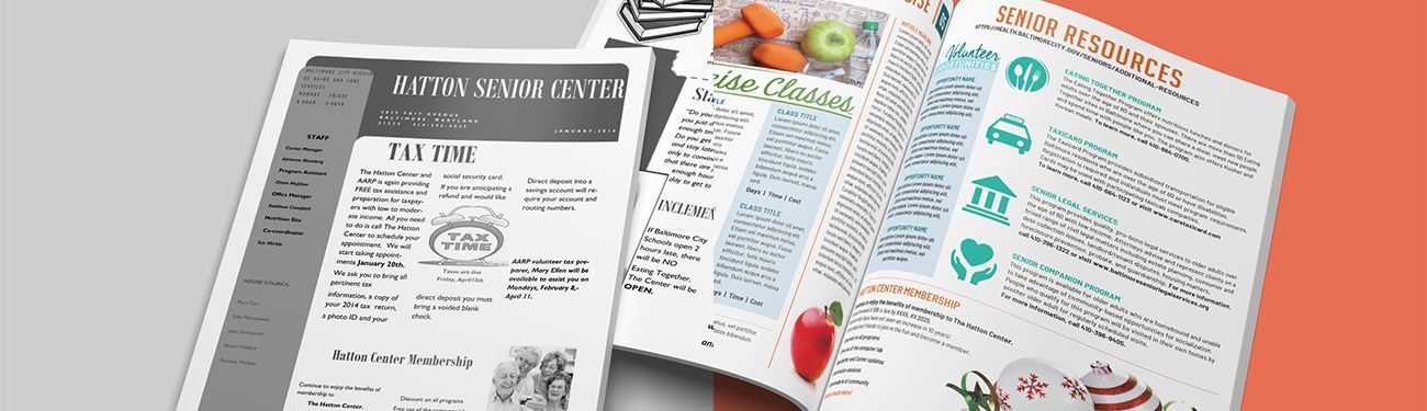
Recently, we shared a free guide to everything your community orgazation needs to know about print newsletters. We covered topics ranging from why you should consider creating one, what to include, how to make sure it looks professional, and how to get one printed for free. This week, we’re tackling all things related to print newsletter design. We’ll answer some of the questions people often ask about what a reader-friendly newsletter layout should include and guide you through the process.
Design Tips for Print Newsletters
What is the standard size of a newsletter?
The standard size of a print newsletter is 8.5 × 11 inches. This not only makes the publication easy to mail, it also cuts down on printing costs. If your newsletter budget is fairly generous, you can play around with less-traditional sizes.
How do I decide what content to lead and end with?
As is true of digital publications, you want to grab a reader’s attention quickly and make a connection. So, lead with your best stories or events. Don’t save the good stuff for the end — you might lose the reader before they make it there!
But it’s also important to finish strong. It often helps to suggest what action you’d like the reader to take next, such as “Call us to learn more about reserving a spot in one of our upcoming workshops!”
Is design the most important element?
While the design is definitely important, content is what keeps people reading. Spend some time on titles and headlines to make them enticing. Make sure the copy is easy to read and not overly complex. If the topic is a complicated one, break it down into sections with different subheadings.
Does font style and size really matter?
Many people underestimate just how important it is to choose the right font style and size. Though playing around with artistic fonts is fine for some print items, this isn’t one of them. You need something that is pleasing to the eye in a size and style that can be easily read, especially if you have older adults in your target audience.
Sans serif fonts (fonts without tails at the ends of letters) are often used for headlines, while serif fonts (fonts with tails) such as Times New Roman are usually employed in body copy. The general recommendation for size is 10 to 12 points.
Are some color choices better than others?
Color can play an important role in a print publication. It often sets a mood or tone for the piece. For example, green represents nature, harmony, and growth, while red conjures up love and fire. Blue is known to be soothing and convey a sense of trustworthiness.
Spend time exploring the significance of different colors before picking a primary color that reflects your organization. Make sure it works well with the color or colors in your logo. After you’ve settled on a main color, most organizations will want to have one or two more complementary colors. That helps make the newsletter more appealing to the eye.
If you’d like to see a few examples of print newsletters that connect and engage, check out the before and after images we have on the newsletters section of our website! For more articles about crafting the perfect newsletter for your community, visit the “Newsletter Tools” section of our blog.
Updated on 11-11-2025
Share
You might also like