5 Signs it’s Time to Refresh Your Community Newsletter Design

A well-designed community newsletter reflects your organization’s energy, professionalism, and relevance. But even the best designs can become outdated over time. When you are busy juggling a variety of responsibilities, as most senior center team members are, it’s easy to overlook how long it’s been since your newsletter had a design update.
Here are some signs that your newsletter could use a new look, and tips on how to make impactful updates.
Conducting an Objective Assessment of Your Community Newsletter
- The Design Looks Dated
If your newsletter still uses the same layout, colors, and fonts from 10 years ago, it may no longer reflect the modern, active spirit of your community. While you don’t need to chase every trend, a fresh design can signal that your organization is current and forward-thinking.
Consider updating your color palette with brighter, more engaging hues or adding accent colors to break up the pages and draw attention to important sections. Also, take some time to explore how color choices impact your messaging.
- Your Logo Needs an Upgrade
Your logo plays a leading role in the identity of your newsletter. If your current logo looks pixelated or overly complicated, or if it’s outdated and no longer reflects your organization’s mission, it’s time for a refresh or even a complete redesign.
A modern logo should be simple, versatile, and instantly recognizable. Once refreshed, your new logo will become the foundation for an updated newsletter design that feels cohesive and professional. If you need help with designing a new logo that perfectly reflects your community, our team has worked with nonprofits nationwide to bring their ideas to life!
- The Font Is Tough to Read
One of the most common complaints among readers — especially older adults — is that the text is too small to read easily. If your newsletter uses a font size under 12 points or a hard-to-read script, it will discourage people from engaging.
Consider switching to a font style that experts say is more accessible, such as Verdana, Arial, or Calibri. Good typography improves readability and overall user experience, and can be the difference between someone reading the whole issue or tossing it aside.
- Content Feels Repetitive or Dry
A great newsletter design will draw people in, but good content is what will keep them coming back. If your newsletter feels like it’s just recycling the same announcements month after month, it may be time to rethink your editorial approach and add some filler that’s fun to read.
Add variety with new features such as resident spotlights, Q&A interviews, trivia, volunteer highlights, and health tips. Use engaging headlines and mix long-form articles with short, digestible pieces. Include photos whenever possible to add personality and visual interest. Don’t forget games, comics, and puzzles!
If you feel lost and don’t know where you could possibly come up with extra content like this for your publication, don’t worry! Content libraries such as WeCreate are the perfect solution. WeCreate is filled to the brim with everything from seasonal and informational articles, recipes, comics, games, graphics, and more, that you can drop directly into your newsletter! All available for you to use as your own to liven up your newsletter and entice your readers.
- It Doesn’t Translate Well to Digital
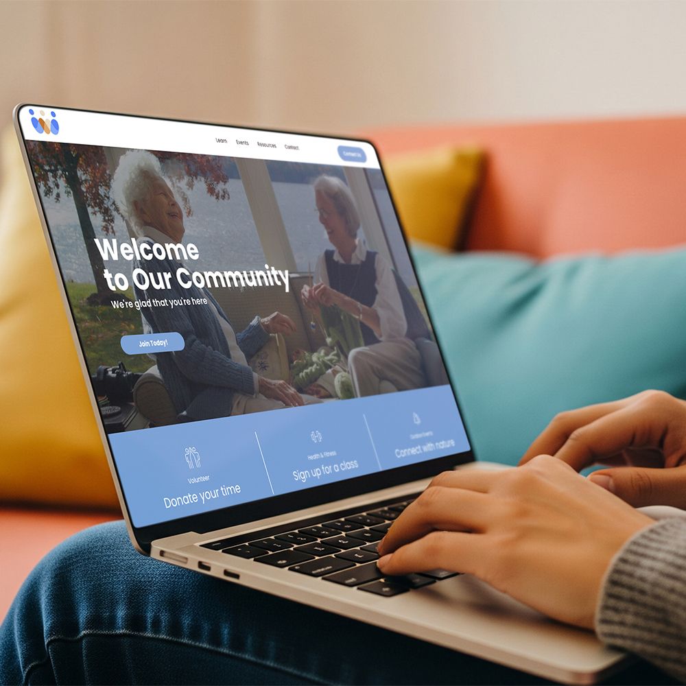
More communities are shifting to or adding digital newsletters to their marketing toolbox. If your current layout doesn’t look good on screens or doesn’t adapt well to mobile devices, it's time for a redesign. Some newsletter services offer an easy-to-access digital version of your newsletter at no extra cost! This way, you can design your print newsletter and automatically have a digital one to email to folks or link on your website, as well!
A responsive design ensures your content looks great whether someone is reading on a phone, tablet, or desktop. Make sure your digital version is mobile-friendly, uses web-safe fonts, and has clickable links for easy navigation.
- Ask for Input
If fewer people are reading your newsletter, attending events, or commenting on featured stories, your current format may no longer be effective. If people aren’t taking the time to review it, they may be missing out on what you offer.
Don’t be afraid to seek honest feedback. Survey your members to ask their thoughts on what does and doesn’t work in your current publication. You could also invite people to participate in a focus group and share their opinions.
LPi Newsletter Services
We understand how tough it can be to find time in your busy schedule to take on a project like this. That’s where LPi’s newsletter service comes in. You’ll find quick and affordable assistance with everything from art and content to design support. The best part? LPi’s print and digital newsletters are free for organizations like yours, thanks to ad support!
For more newsletter inspiration and ideas, head over to the “Newsletter Tools” section of our blog.


