Blog Layout
9 Design Tips to Take Your Newsletter from Good to GREAT!
LPi • Jan 30, 2023
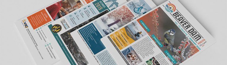
Looking for simple tweaks that can make a big difference in your newsletter design and layout? We help design and print newsletters for thousands of nonprofits across the country so we’ve compiled nine suggestions from the LPi graphic design team that can improve your newsletter for increased readership!
- Stay consistent in your newsletter design. For instance: pick three fonts to use throughout your newsletter and stick to those three. Imagine a newspaper — there’s the fancy font calling out the title at the top of the paper, the bold, colorful letters of the titles, and the smaller print of the paper itself. The practice of consistency can make your messaging feel more cohesive.
- Lean into art. Break up swaths of text with appealing, seasonally appropriate images. In the spring months, consider photos of cheerful spring flowers! During the holidays, invoke warm memories with images of baking and togetherness. Images make your piece more inviting. Looking for some great options? Check out WeCreate, a digital library for communities like yours filled with graphics and content that is pre-designed and ready to be used in all of your communications!
- Consider what you can eliminate. Just like a good house cleaning can help you feel more peaceful, a well-planned newsletter that isn’t crammed with text can be more appealing to readers. Consider moving things like staff information to inside pages so your front page is open for more important informational content or beautiful art and graphics.
- Colored text boxes > outlined text boxes. Using text boxes with a black line or “stroke” or “border” outlining the text box makes your newsletter look outdated. For a fast tweak that modernizes your design, consider removing the border and setting the background color of the text box to something with a light color. This will add a pop of color to your design while continuing to separate pieces of text from other parts of the page.
- Update stale clip art. Does your fitness instructor graphic still have 80’s shoulder pads and a big ol’ perm? Old clip art communicates stodgy programming and poor attention to detail. Breathe some fresh air into your newsletter with modern takes on classic favorites. Use a tool like WeCreate to make the search for updated imagery easy for yourself!
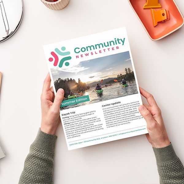
- Bring in photos. “A picture is worth a thousand words,” right? Adding photos to your newsletter tells a fascinating story about what your events look and feel like. Also, when folks see themselves in your pages, it helps them feel like they are a valued part of your community.
- Consider a three-column layout. Want to try something that’s a little more visually appealing? Try a three-column format instead of a two-column format in your layout. This might look like a narrow column on the left of a page, and a wider column that takes up 2/3 of the page on the right. The “Rule of Thirds” is popular in design for its ability to bring a sense of balance into a layout.
- Reign in wild fonts and colors. Standardized fonts and colors make your newsletter look more polished and professional then mismatched “fun” fonts. Let your programming and images be the most exciting part of your newsletter … not unexpected font treatments.
- Even small steps can make a big difference. Considering an overhaul is a daunting If you’re in need of some changes, give yourself permission to start small. Maybe first you redo your first page. Next month, you standardize your fonts. After that, you start including more images. Whatever your steps are, starting somewhere will help you reach your end goal more quickly.
Your updated design communicates more than information to your community, it also says: “We’re professional, friendly, and responsive!”
If you are looking for help with your newsletter or even an overhaul for your brand, LPi can help. We love working with nonprofits to dial in their communications!
Updated on 03-25-2024
Share
You might also like

Trying to learn more about creating newsletters for your senior center? Master the basics with our dos-and-don’ts list.
Are you getting ready to launch a newsletter for your senior center or aging services organization? These tips will be of interest.
Considering creating an end-of-year recap to share with your supporters? Here are a few reasons recaps are helpful, and some tips on how to get started.